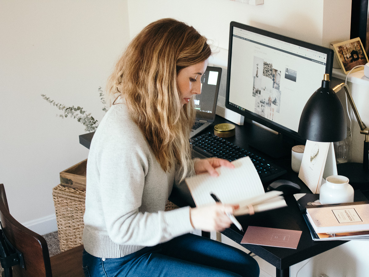
I’m so excited to say ….The LD has a new look! I’ve had this blog for about a year and half, so I was ready for a change. It was time for the site to look more modern and in line with where I want The LD to go. I love that the site has a wider lens because it shows off the imagery and layout so well now. I want this little place on the internet to be aesthetically pleasing and also functional. I hope with the redesign you’ll find that!
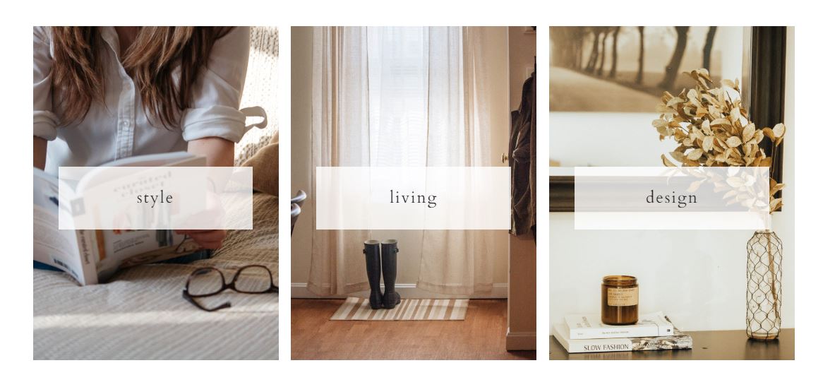
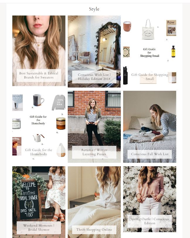
I added three main categories on the homepage since I tend to write about those topics the most and when looking at the statistics from 2018, you like those topics too! The category pages are a game changer with this new theme. All posts under a specific topic are now easier to digest and visually take in.
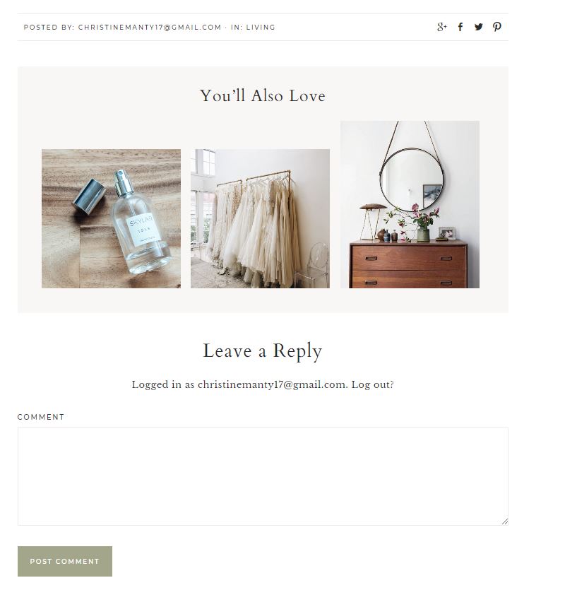
You’ll also notice a “you’ll also love” section at the bottom of posts. This way you can see other like-minded posts and it makes the search that much easier!
I’m still making tweaks and will always be open to making small changes here and there to improve the usability of this site. I actually love this part of having a blog! I find the back end of a website so interesting and a lot of fun. A lot of it is problem solving and troubleshooting, which I love to do. I also want to hear from you guys on how you like the new look! Leave a comment, DM me or email with suggestions, comments and feedback. I want this space to be a place that works for you.
I cannot end the post without mentioning how talented the 17th Avenue Designs are! I got this theme from them and it was a seamless transition. I love their modern typography and functional designs. There’s endless amounts of customizing and making it your own. More to come!
xx
Leave a Reply